This beautiful 1930’s Tudor home had charm throughout but the kitchen just wasn’t functional for them. The kitchen had been remodeled in the 50’s and updated in the 80’s and didn’t provide the storage, countertop space or flow they wanted. But with this age and style of home they wanted something that fit the home well and looked like it had always been there. We got to work!
Problems/Challenges:
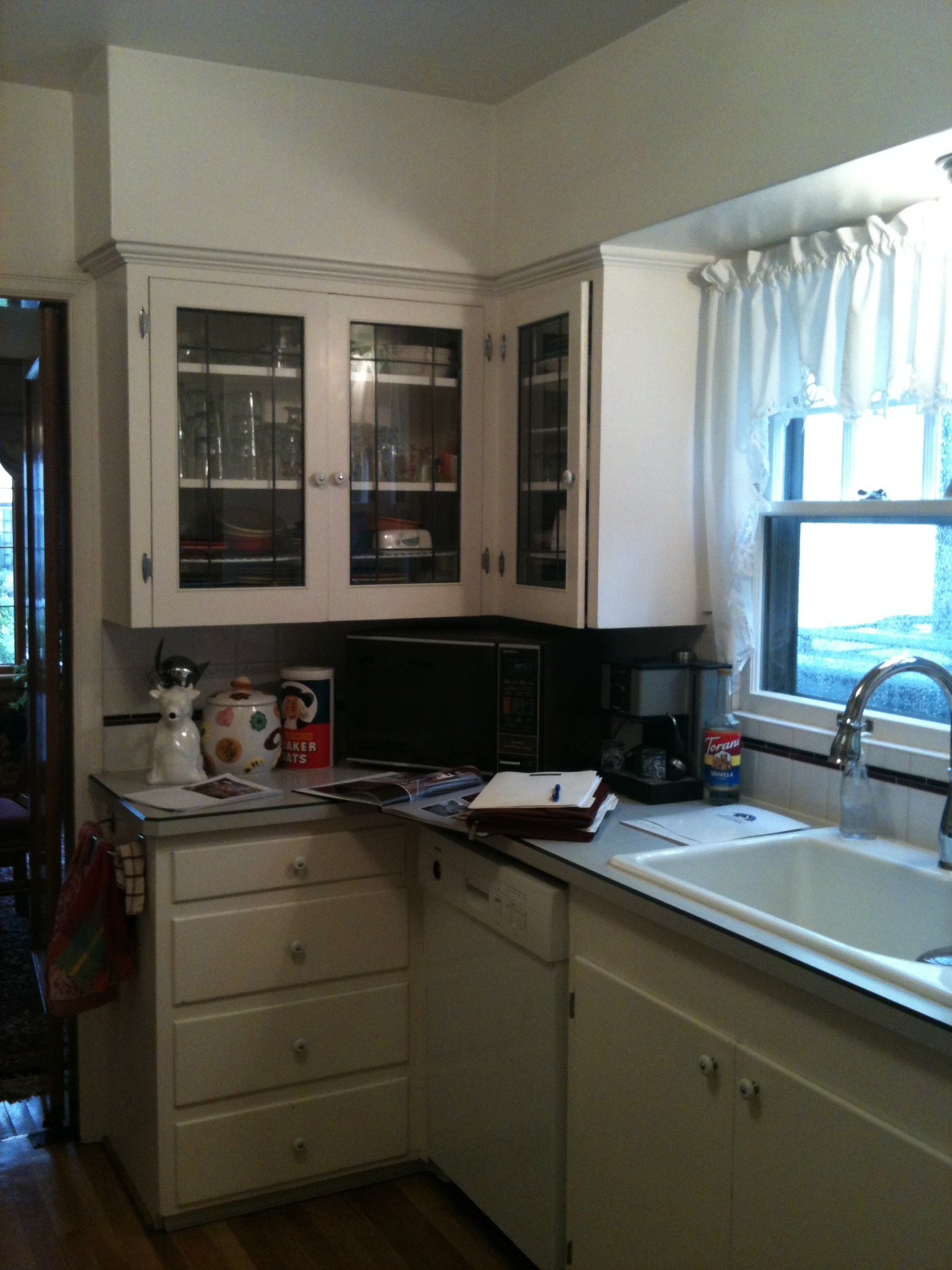
- Kitchen was tight cramped.
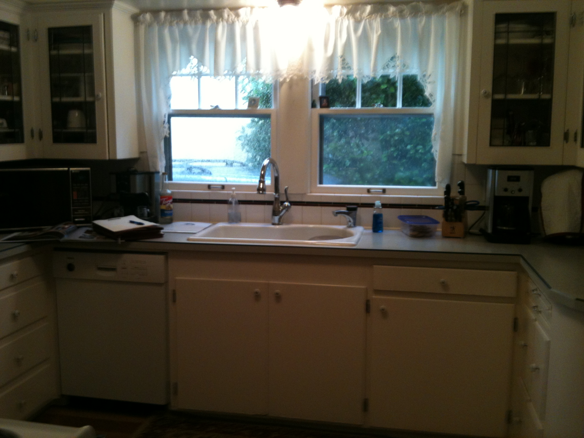
- They couldn’t fit a full size fridge in and didn’t have any countertop space around the range.
- Not enough storage.
- Lighting was poor throughout.
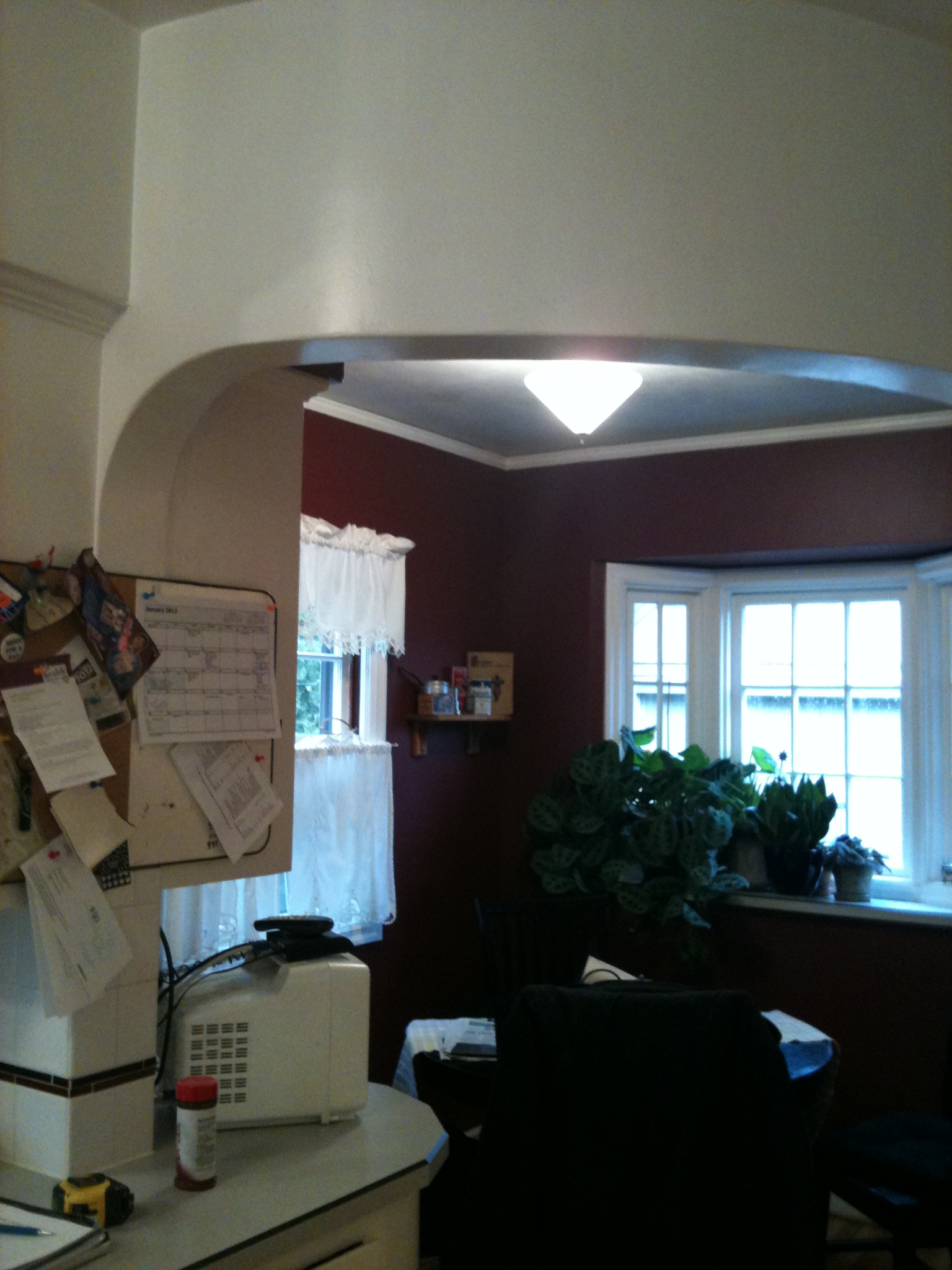
- The eat in nook while full of character – was too small for their family of 4 and closed off the space. They still wanted an eating area in the kitchen.
- They loved the leaded glass doors and wanted to find a way to incorporate that into their new kitchen
- Wanted pantry space.
- It was important to keep with the character of the home during the remodel.
- The kitchen houses 3 doorways, all of which felt very tight and cramped especially since it is a major thoroughfare.
- A place for a built-in microwave off of the countertop and for wine.
Solutions:
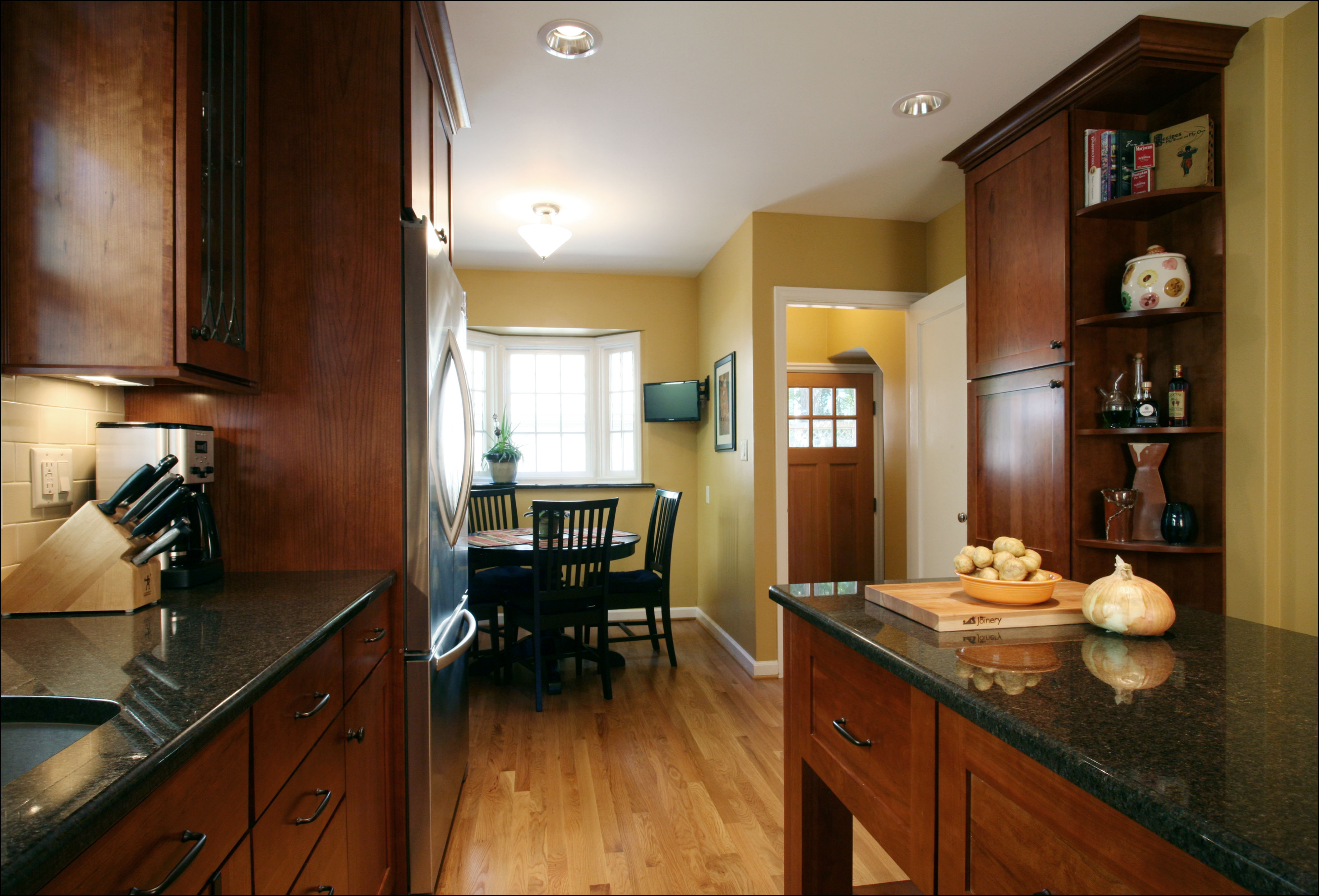
- Opened up the eat in nook to the rest of the kitchen making both spaces feel larger and bringing more light into the kitchen.
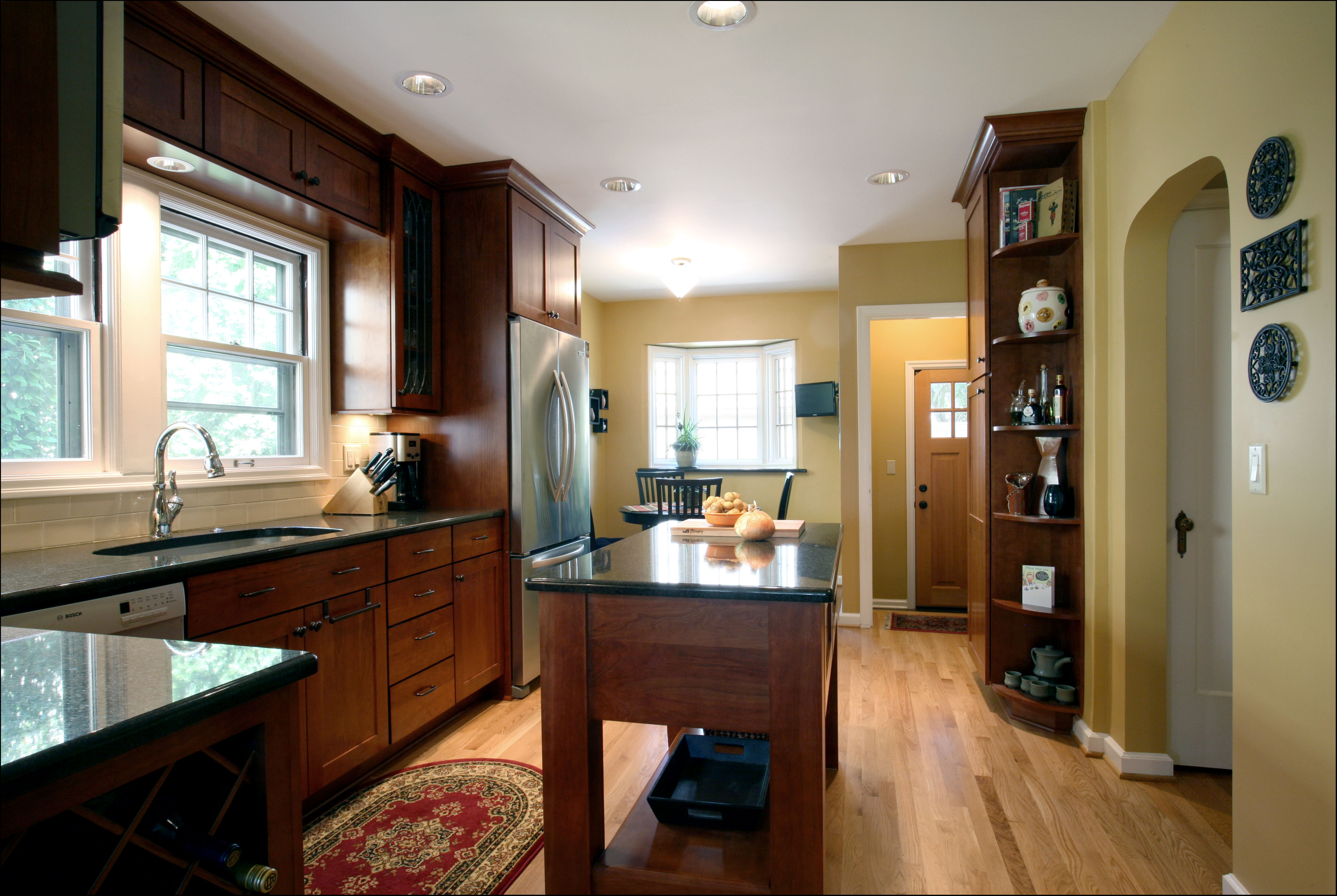
- Modified the depth of the built-in in the hallway to allow for the range wall to recess, effectively expanding the kitchen.
- Expanded the openings into the dining room and the hall and repeated the arches seen in the rest of their home.
- Hanover Cherry Light cabinetry provided a rich warm wood that compliments the style of the home well. Simple Shaker details and crown were used to complement existing woodwork in the home.
- A narrow, furniture island provides a great work space and extra storage while not looking too bulky
- Removed the soffits to bring the cabinetry to the ceiling providing more storage in the space
- Leaded glass door cabinets on either side of the window retain the character of the old kitchen
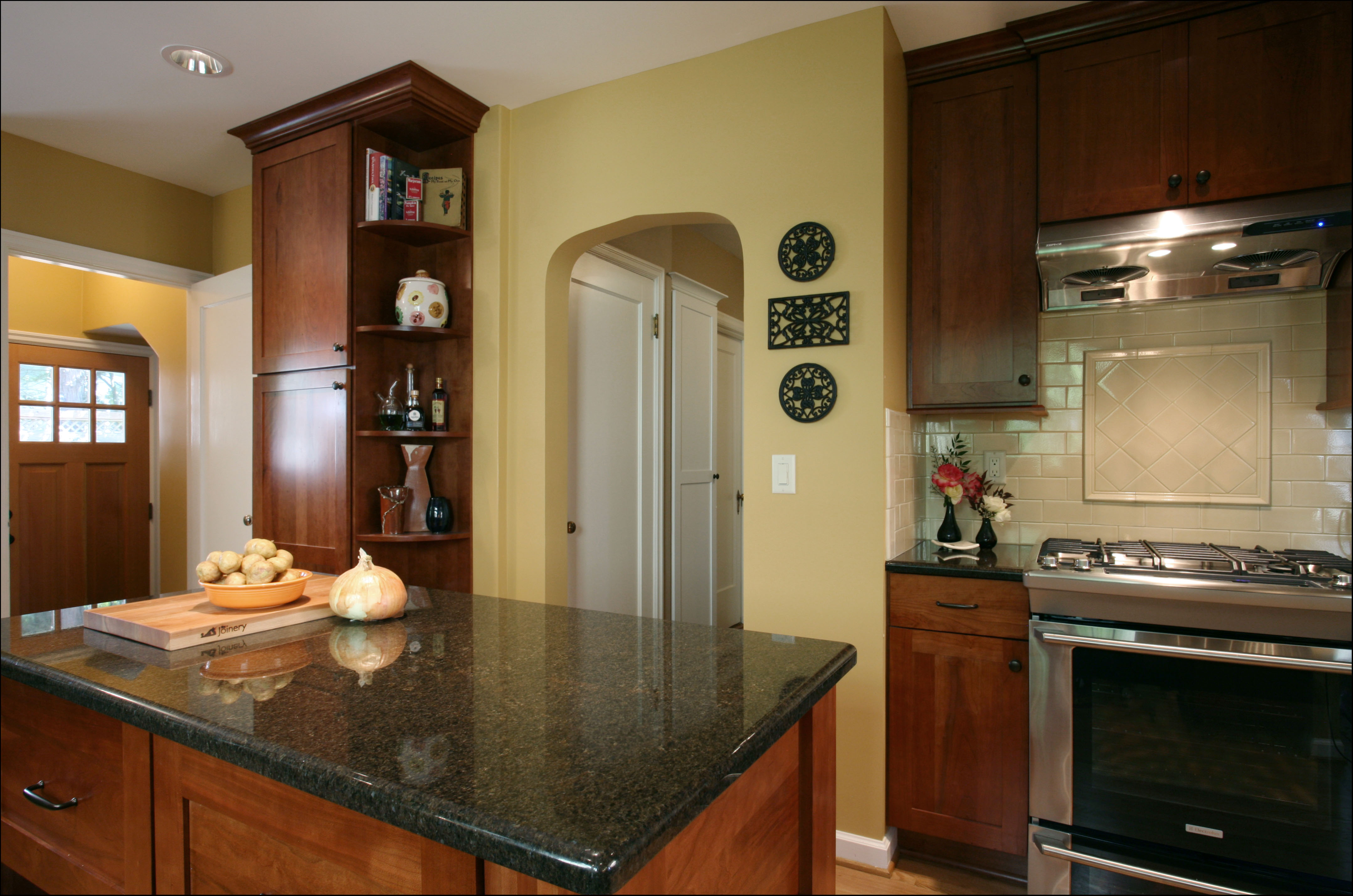
- Added a shallow pantry with open display area for extra storage that doesn’t look heavy.
- An angled pantry between the kitchen and nook provides extra storage without infringing on the dining space.
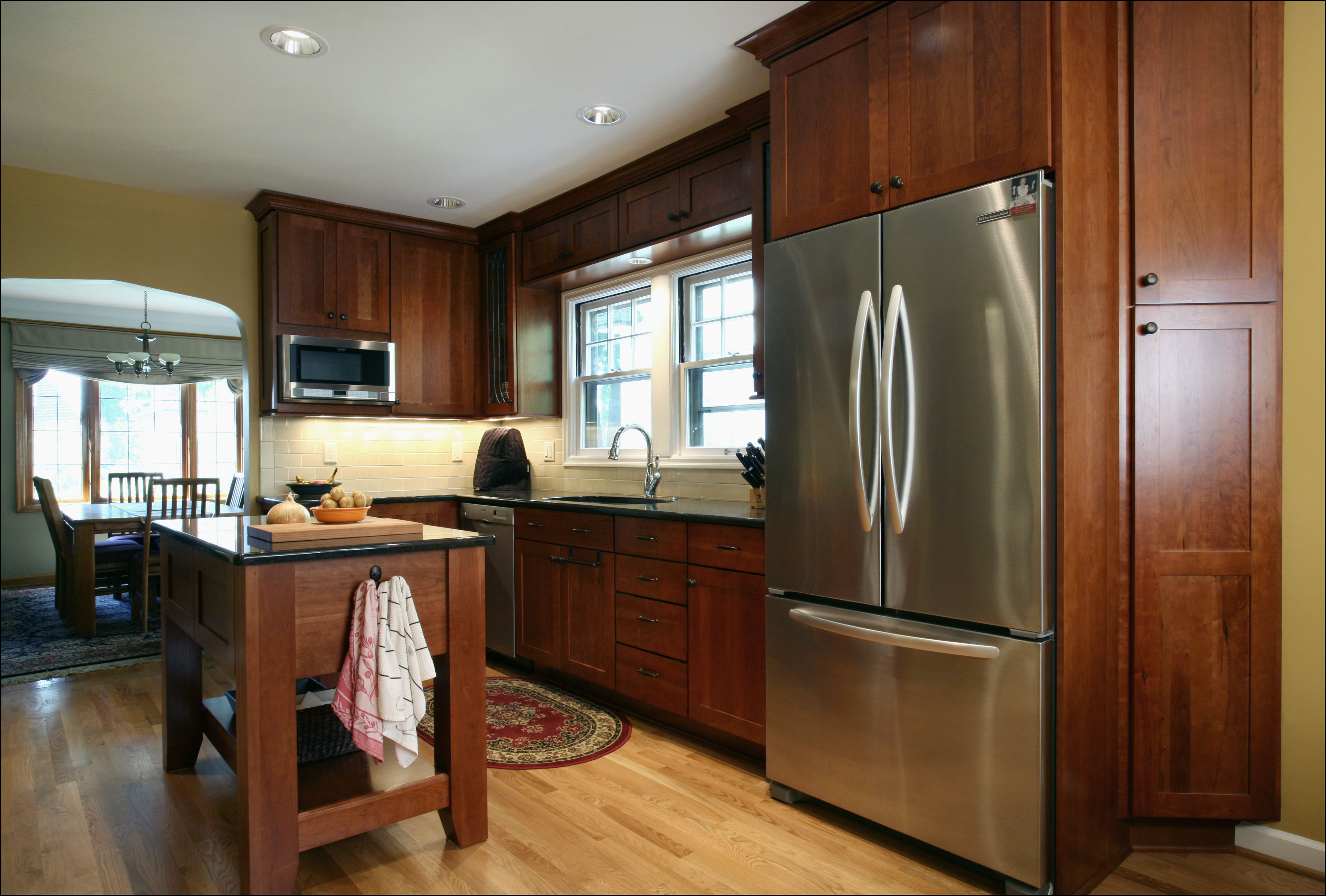
- Efficient storage space was important in this kitchen – we added blind corner pullouts, spice racks on the doors, pullouts, a wine rack, garbage pullout and even a compost bin on the back of the sink cabinet door. Tray dividers above the refrigerator organized their trays, platters and casserole dishes.
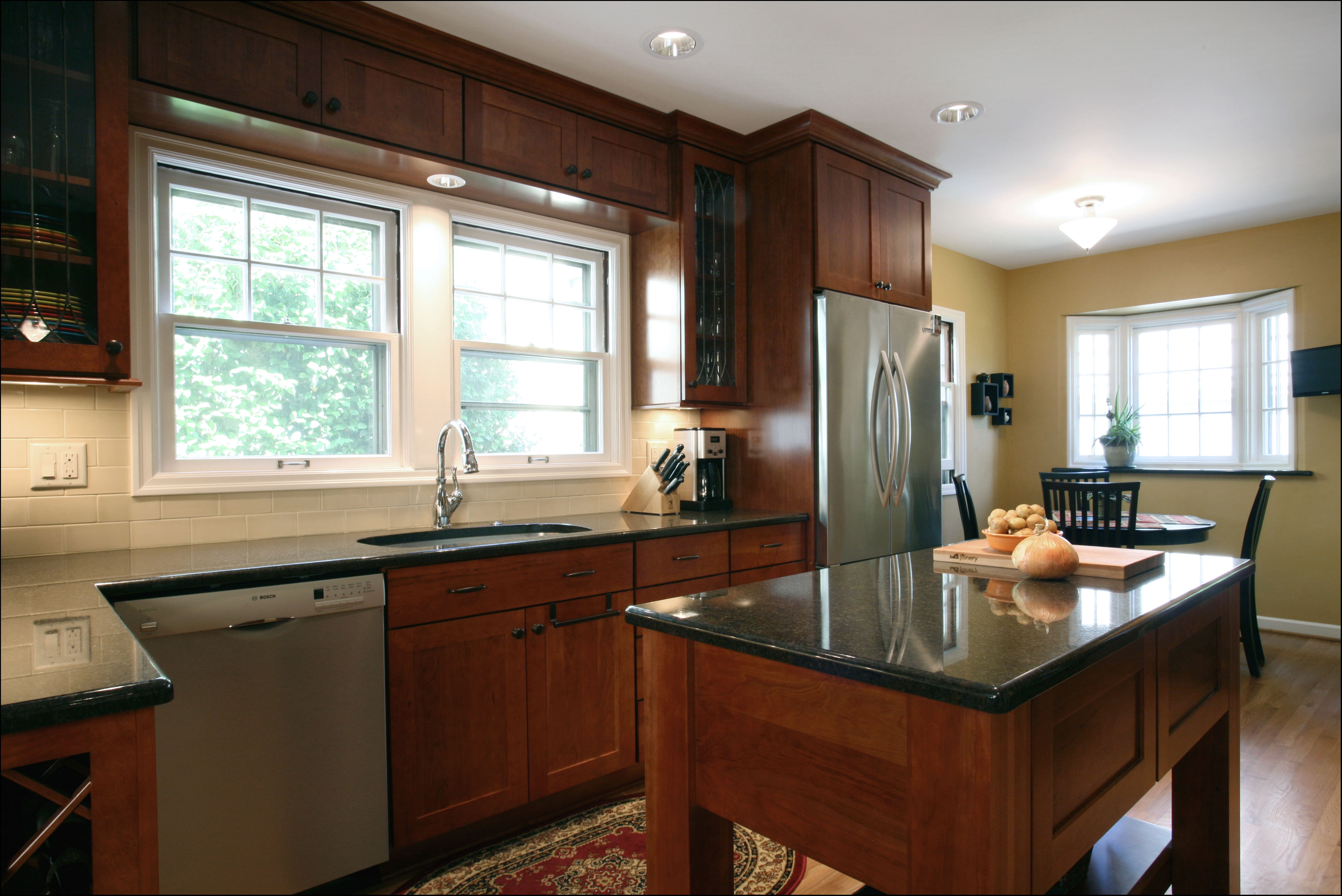
- Under cabinet lights and recessed can lights throughout illuminate the entire area.
- Messouri Black granite countertops and hand-made subway tile finish off the classic look in their kitchen.
When the project was finished the clients were thrilled with the feel and function of this new kitchen in their old home!
Designer: Crystal Kennedy
crystal@pnwcab.com
503-652-1268
Photographer: Shannon Butler
photoartportraits@gmail.com
503-891-9354